Chart cards
Users can only create line and bar charts for the moment.
This view is divided into three blocks:
- Card options and Display
- Series
- Previsualization: Any change on the first two will take effect on this part, just to be sure what you are doing is what you want to do.
Series
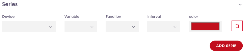
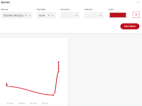
- Device: To start configuring a card, the first thing that users have to do is select a device.
- Variable: Then users have to select a variable which is the sensor we have to show information.
With these two parameters selected, the previsualization block will display the chart.
- Function:
- Interval:
- Color:
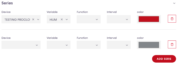
Users can add more series by clicking "add serie" button and a new line will be created, ready to be configured as the same procedure described, and as many times as users desire.
Card Options
- Title:
- Desktop:
- Mobile:
- Height:
Display
- Plugin:
- Stroke curve:
- Data labels:
- Markers size:
- Stroke width:
- Zoom enabled:
- Show toolbar:
- Show grid lines X:
- Show grid lines Y:
- Show Y axis:
Chart controls
If users enable zoom and toolbar, these extra options will be available on the chart.

 Zoom in
 Zoom out
 Zoom selection
 Panning: With this tool selected, users can move the chart from left to right and vice-versa.
 Zoom reset: Zoom will be reset with the original one where the whole chart data is visible.
 Download: Three download options of the chart will be displayed. SVG, PNG and CSV.
Once the configuration is ready, users can save their job by clicking on "submit" button on the top-right side.